In the following tutorial you will learn how to create your own web buttons set. First, using the Rectangle Tool along with some Pathfinder and Offset options plus a Rounded Corners effect you will create the three starting shapes. Next, a linear gradient plus some Film Grain and Drop Shadow effects will complete the overall button. Finally, some text and a new Drop Shadow effect will help you finish the work. Let’s get started!
Step 1
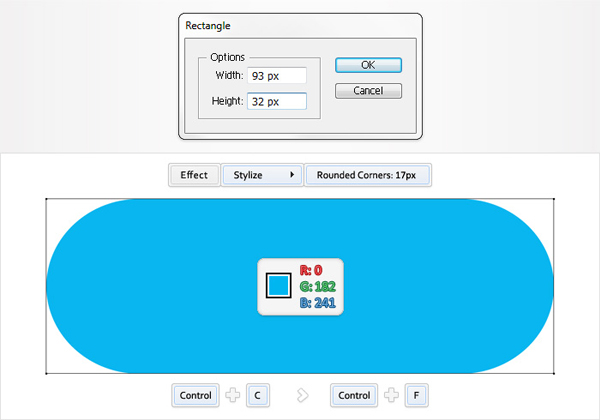
Pick the Rectangle Tool (M) and click on your artboard. Enter 93 in the width box and 32 in the height box then click OK. This will create a 93 by 32px shape. Fill it with R=0 G=182 B=241 then go to Effect > Stylize > Rounded Corners. Enter a 17px radius then click OK.
Now, your shape should look like the following image. Select it and hit Control + C then hit Control + F. This will add a copy in front. Have a quick look in your Layers panel (Window > Layers) and make sure that you have the two shapes created so far.
Step 2
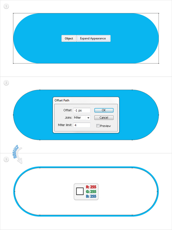
Select the copy made in the previous step and go to Object > Expand Appearance. Select the resulting shape and go to Object > Path > Offset Path. Enter a -1px Offset then click OK. Fill the resulting shape with white then reselect the expanded, blue shape and delete it.
Step 3
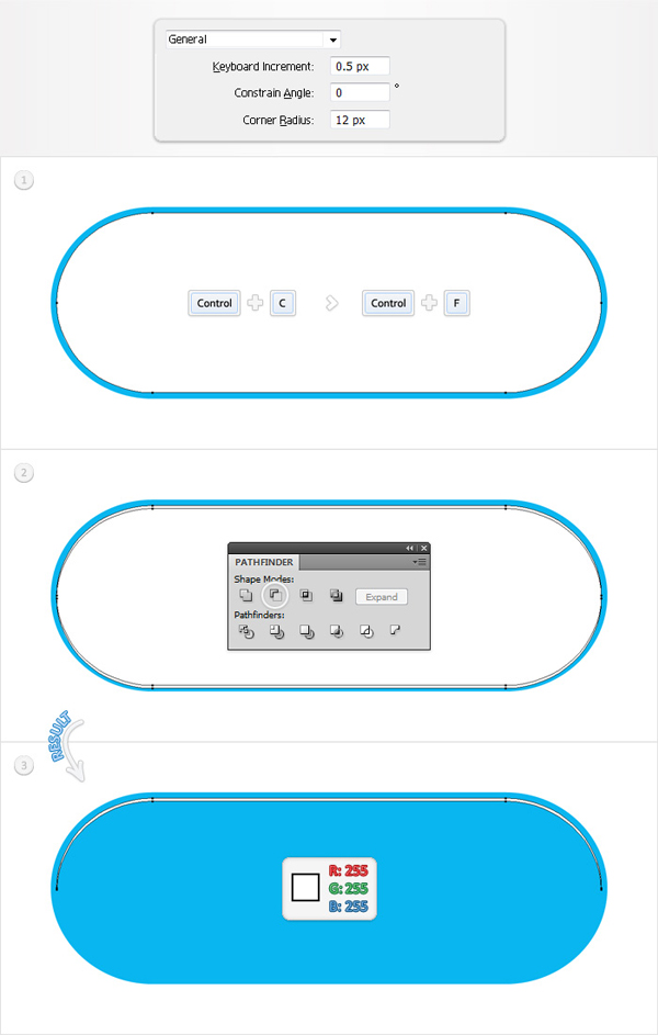
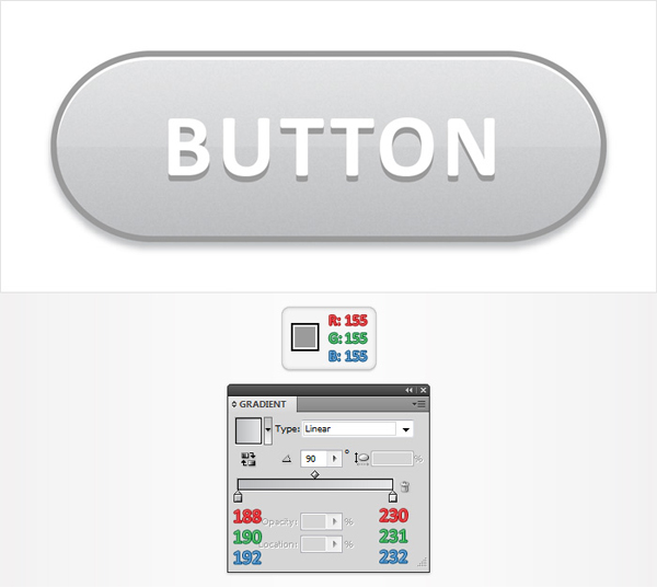
Go to Edit > Preferences > General and enter 0.5 in the Keyboard Increment box. Reselect the white shape and make a copy in front (Control + C > Control + F). Select this fresh copy and hit the down arrow once (to move it 0.5px down). Reselect both shapes and click on the Minus Front button from the Pathfinder panel. The resulting shape should look like the third image below.
Step 4
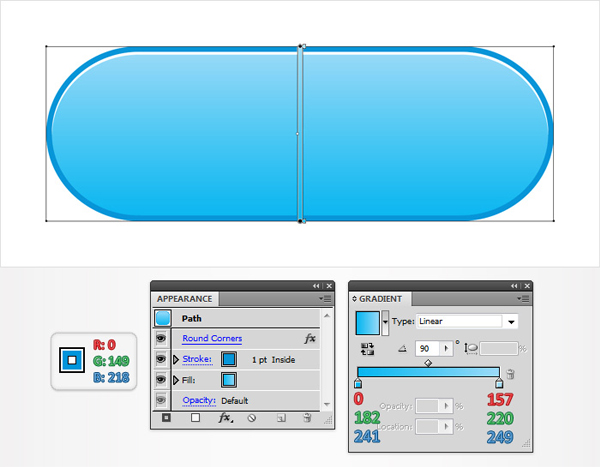
Return to the blue shape. First, replace the flat blue with the linear gradient shown below then add a 1pt stroke. Align it to inside, set its color at R=0 G=149 B=218 then make sure that the Rounded Corners effect is in the top of the Appearance panel as shown in the following image.
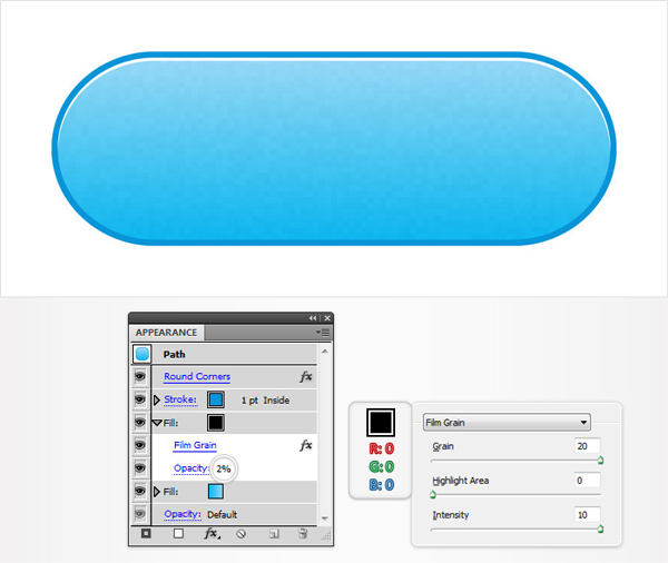
Step 5
Reselect the rounded rectangle and go to the Appearance panel. Open the fly-out menu and click on Add New Fill. Obviously, this will add a second fill for your shape. Select it from the Appearance panel and make it black then lower its opacity to 2% and go to Effect > Artistic > Film Grain. Enter the data shown below then click OK.
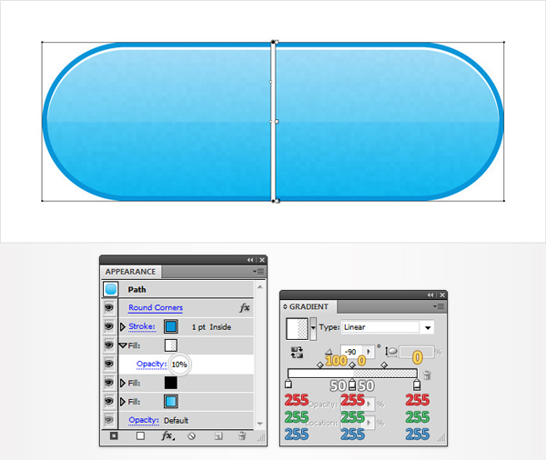
Step 6
Add a third fill for your rounded rectangle. Select it from the Appearance panel, lower its opacity to 10% then use the linear gradient shown in the following image. The yellow numbers from the gradient image stand for opacity percentage while the white numbers stand for location percentage. This means that you have to select each gradient slider and set the location/opacity percentage as shown below. Pay extra attention to the middle section of the gradient . You should have two overlapping sliders. One has the opacity set at 0% and the location at 50% while the other one has the opacity set at 100% and the location at 50%.
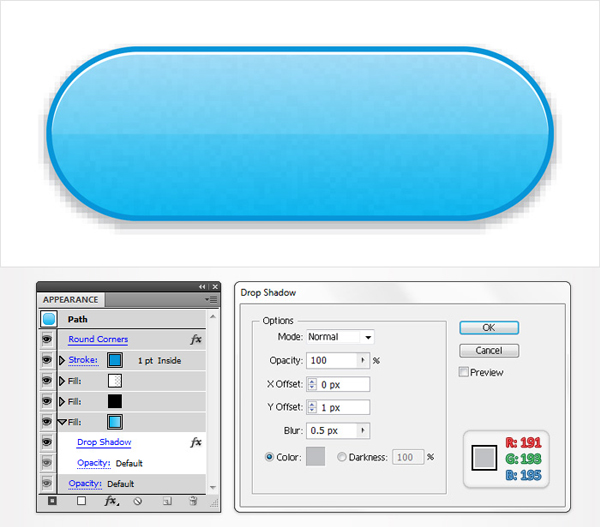
Step 7
Reselect the rounded rectangle and go to the Appearance panel. Select the bottom fill (the one with the linear gradient) and go to Effect > Stylize > Drop Shadow. Enter the data shown below then click OK.
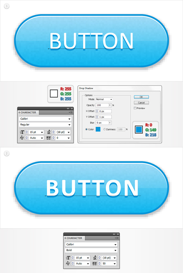
Step 8
Finally, add some white text. Use the Calibri font with a size of 15px then go to Effect > Stylize > Drop Shadow. Enter the data shown below then click OK. For the pressed version of the button you can set the style at Bold and the tracking set at 50. It should look like the second image below.
Step 9
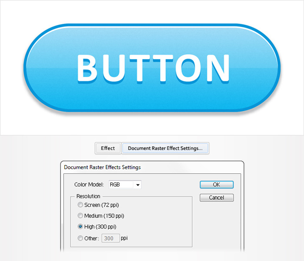
Some of you might not like the pixilated look of the drop shadow effect. Here is how you can improve it. Go to Effect > Document Raster Effect Settings. By default your resolutions should be set at 72 ppi. Set it at a higher value and click OK. Choose 300ppi and your button will look smooth like the following image.
Step 10
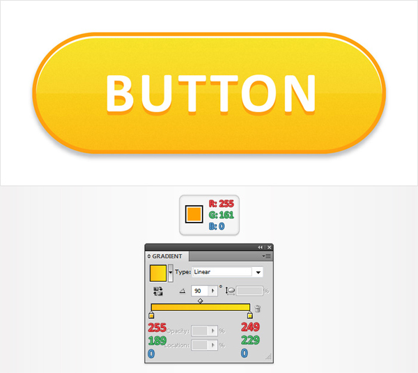
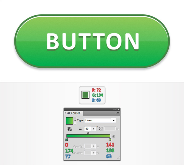
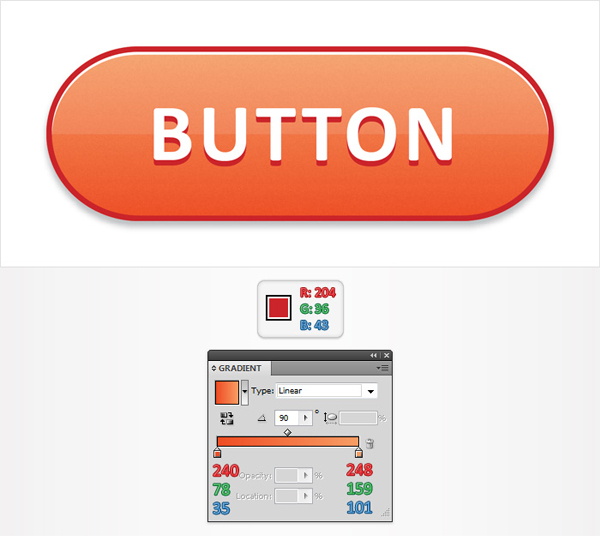
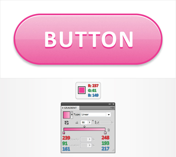
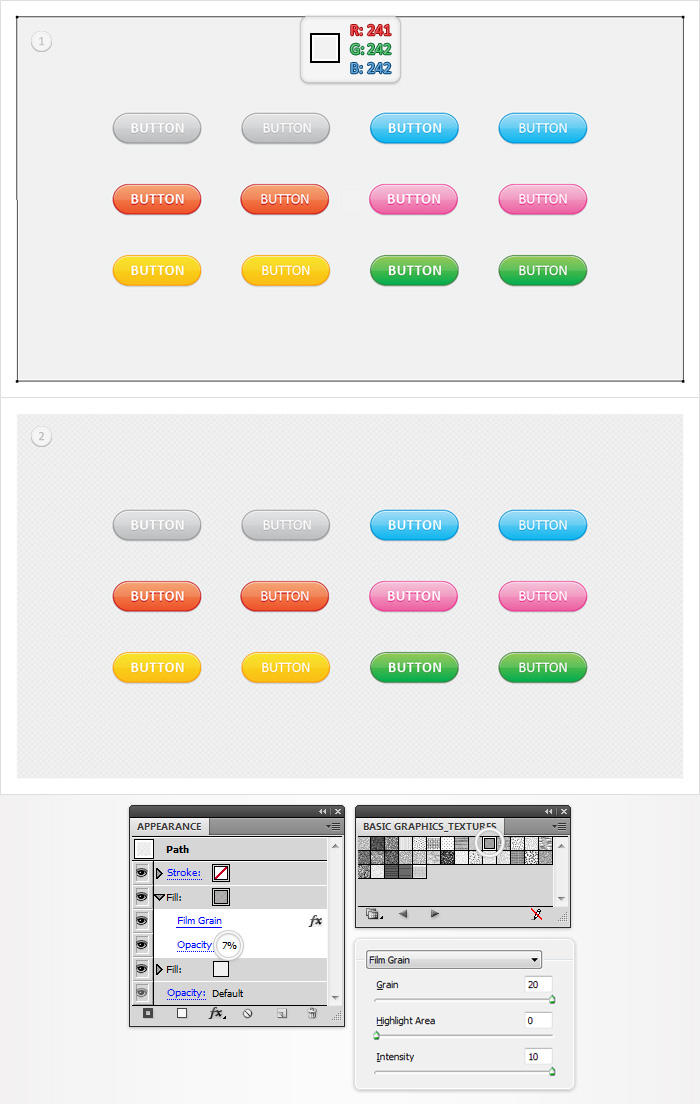
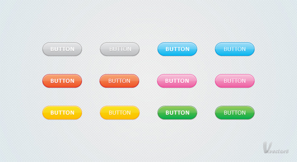
Here are some other colors that you can use for your button. In the following image you can find the color properties that you must replace. The linear gradient is for the rounded rectangle while the flat color is for the stroke and the drop shadow effect applied to the text. Naturally, you can add your own set of colors. There are countless possibilities.
Step 11
Finally, here is how you can create that patterned background from the final image. Pick the Rectangle Tool (M), create a shape the size of your artborad and fill it with R=241 G=242 B=242. Make sure that this new shape is selected, go to the Appearance panel and add a second fill. You will need a build-in pattern for this new fill. You can find it through the fly-out menu of the Swatches Panel. Simply go to Open Swatch Library > Patterns > Basic Graphics > Basic Graphics_Textures and a new window with a bunch of nice pattern will open.
Look for the "Diamond" pattern (first row, column ten). Reselect that second fill, add the Diamond pattern, lower its opacity to 7% and go to Effect > Artistic > Film Grain. Enter the data shown in the final image and click OK.
Step 12
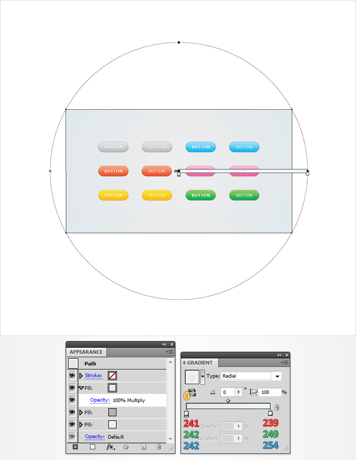
Reselect the shape created in the previous step and add a third fill. Select it from the Appearance panel, change its blending mode to Multiply and use the radial gradient shown below.
Conclusion
Now your buttons set is done. Here is how it should look. I hope you’ve enjoyed this tut.
0 件のコメント:
コメントを投稿