2012年1月30日月曜日

Why Every School Must Teach Design

Why Every School Must Teach Design:

Do something for me. Stand in front of the mirror and just look at your physical beauty. Can you imagine the immense amount of thought that would have gone into designing something as complex as a human being? I believe in evolution, and if you look at it, it looks a lot like the process a design might use to get to a final design. Imagine how the first human being came into existence. Think about how Earth was designed in a manner that it will have day and night. Humans were designed to work during the day and rest (as in sleep) during the night. Can you see how every design of nature relates to each other? Every design is so beautifully crafted that you won’t notice anything unless you actually look at it the way I want you to. Design is such an integral part of everything that it must be taught to humans from the time they start school. It is simply mandatory.


So, why a complete article on this topic?


Agreed. Why would I want to write a 1200+ word article on a simple to understand topic? Well, I want to because we might understand the importance of design, but somehow we haven’t implemented it in our education system yet.


Look, I am not sure if your country (or your school) teaches design to every student or not, but believe me this isn’t very common. Most educators still think along the lines of – “Teach design to a science student? Are you crazy?” – which, really, is not at all that weird. Actually, I understand their issues, this example here sounds a bit unrealistic doesn’t it?


I want to put forth one more point before I move forward. I agree that the readers of 1WD have very little free time, but it is my sincere request that you read this article. True designers are hard to find and the time is very near when all that we will have are designers who imitate someone else’s design. We have to pave way for the real designers and innovators.


At Least Teach Design Thinking?


One needs to understand the thought process that is involved in design in order to come up with original designs. Design is an art that truly cannot be taught, but what one can teach is the design process. This approach which might help the other to develop an eye for true designs.


I imagine a world where every school teaches designing. It need not reside in a particular school. Rather, every school should understand the creative reasons behind design teaching and bring design into their daily teaching process.


Be it a science student or a Math student, one must understand the importance of Design Thinking. What is the fun in being a science student when you cannot relate to the beauty of Pluto’s cold temperature or Amoeba’s style of multiplying itself. Also, what is the fun in being a Math wizkid when you haven’t yet mastered the art of calligraphy? Remember that each curve and each bent in lines has a fixed angle. Calligraphy isn’t as easy as it might look like. Angles matter a lot and who could be a better student than a Math wizard when it comes to angles?


So, What is Design Thinking?


Design Thinking will not be a topic of discussion that you can find in books. There is nothing like D-school (though they have started to pop-up nowadays) like our B-schools.


  • Design Thinking is something that will integrate your imagination with the strategy to do work. This is when your eyes will start looking at things from a totally different perspective. This is when you become super comfortable even when you are lost in a new world. You will be able to find something that will interest you even in the most weird places possible. It will be this thought process that will give birth to ideas and lead you into paths beautifully unknown.

  • Design Thinking is the art of finding something useful even when there is a scarcity of resources. It creates meaning out of everything and gives life a direction. Design Think generates interest in the dull (and documented) approach of doing things.

  • Design Thinking is something that will help one to visualize the unimaginable. The power to asses the most complex data available. The art of juvenile approach to life.

  • As I said earlier, Design Thinking is a process that cannot be completed in one day. It arises from the need of the hour where the pre-defined process is either outdated or not applicable. In such conditions it will be the instant ideas that will help you out and it will be a brain educated to under design process that will help you out in such scenarios.

  • Lastly, Design Thinking is the process of feeling the core of everything. You can actually sit in the center of the problem and understand the root cause before giving out solutions.


But, Only Design-Thinking Won’t Do!


All this time I was preparing you for the real thing. If you are still sticking around then let us dive into the last section of our discussion which will actually make more sense to all of us.


We started with Design Thinking as that was the first step into the world of Design Learning. But, that is just a step. I agree that Design is the art of finding meaning in haystack but that isn’t it. Design is a lot more than just vague ideas popping out of nowhere. Visit the Vatican once and you will know how complex designs can a human mind generate. They just keep getting better with every passing minute in the Vatican.


Installing the craze for Design Thinking is like giving a dream to an aimless child. You cannot just ask the child to dream, can you? Rather, you have to help the child understand the process which will help him achieve that dream. Get the point? This is where it becomes important to enhance the teaching process. Like, including the process of crafting along with thinking.


Let me pick up the example of Math student once again. You opened the eyes of that Math student towards Design Thinking but do you think he will be able to love Designing unless he knows how to actually design? This is when the overall process of creating typography comes in. You taught Design Thinking. Now teach Designing.


What I am trying to convey is that we are not looking for MBA style designers who can sell any design but aren’t aware of how to bring that design to life. We aren’t discussing the process of creating Design Leads or Design Managers. Rather, we are dreaming to create Designers who can be their own leaders. Their own inspiration. Be Raw. Real.


Conclusion


My idea behind this article was the hint that I have been getting lately. The attention to detail seems to have lost in D-schools and upcoming designers. They concentrate more and more on hefty paychecks and less on jaw dropping designs. What we are searching for here are those new genre of designers who are meaningful and who make some sense. I ain’t looking to generate glossy flash artists. Rather, I am looking for staggering designs by stunning designers. Let’s be stylish. What say?

Colour Chronicles: Brilliant Blue

Colour Chronicles: Brilliant Blue:

Welcome back to another colourful article, this time dealing with last month’s favourite, chosen by you! Just as last time, it includes a showcase of websites, artwork and palettes, so there is a little something for everybody.


Basics


Blue is one of the three primary colours and as such is also part of the chromatic spectrum. It is a cool colour which covers a relatively wide area of the spectrum, ranging from cyan to a more violet tint. Of course you could always nitpick, but there is usually little doubt as to what all its different shades should be called; light or dark, greenish or not, you can still call it blue and get away with it.


Characteristics


According to its proper theory, blues are considered far colours, meaning that they seem to expand whatever shape they fill; a room, for example, will seem larger if painted blue, rather than yellow or orange.


It is easily perceivable by the human eye, given that blue colours present a wavelength between 440 and 490 nm. All three types of photosensitive cells respond to this range, albeit to varying degrees. On the other hand, the inclusive nature of the name means that some shades are (literally) easier on the eyes than others. Nevertheless, blue is a common sight in top favourites.


Symbolism


Although present in living beings (mushrooms and frogs, for instance), generally it has more inorganic and abstract associations.


One of these is the sky. Light tones give a sense of open space and freedom, an overall calming effect. Using light blue backgrounds in web design can make a site look friendlier, but large backgrounds have the risk of becoming dull. To avoid this, take inspiration from nature: the sky is much more appealing when the Sun creates a sort of gradient, rather than when it’s more or less one solid colour.


featured-trondheim-omgivelser-helene-rojas-nagel

"Trondheim omgivelser" by Helene Rojas Nagel


Next is the sea (or water in general). As a symbol of life and vitality, it also represents versatility; you can find it nearly everywhere, filling different shapes in different states. Although it is colourless in small quantities, in reality water has a slight blue tint that becomes more obvious in large quantities. While the image of a still body of water can be considered peaceful, remember that it can just as easily turn into a source of turbulence.


Blue is also a powerful corporate colour because of its association with stability and confidence. This is also why many IT companies prefer to use it in their visual identity, trying to combat the (to a certain degree) volatile nature of technology. Of course this all depends on the company’s philosophy, profile and desired image, but reliability seems to be the most wide-spread.


Some of the more negative associations are cold and melancholy. Less saturated shades remind of murky skies on cold days, while brighter shades closer to cyan have a frostier feel to them. Also, save for eye colours, the presence of blue on the human body is an indication of something wrong. This can be both physical and mental, hence the expression “feeling blue”.


Combinations


Bright, electric shades of blue create a fantastic effect when combined with dark, ash brown. Although it dominates and gives the overall composition a cool feel, at the same time it manages to generate energy. It works well with dark metallic colours as well.


Together with teal or mint green it creates a natural, watery scheme that is also very fresh and inviting. Of course, there must be some balance and hierarchy between the two colours; otherwise they will compete with each other if they have the same intensity.


Using blue for less important details in orange or yellow schemes can cool down the design and take away some of the glare. While traditionally, orange is blue’s complementary, combinations with yellow will have roughly the same effect.


Palettes


01. Complementary blue by tudor.girba


palette-01-complementary-blue


02. Swimming Sports by julievonderropp


palette-02-swimming-sports


03. Sunny Shores by twinklebunnytoes


palette-03-sunny-shores


04. Sea Foam by louisan


palette-04-sea-foam


05. Lilac Bathroom by nightzdragonz


palette-05-lilac-bathroom


06. Leviathan by matthepworth


palette-06-leviathan


07. Bleu Blanc Rouge by kuler


palette-07-bleu-blanc-rouge


08. blueberry pie by elsabartley


palette-08-blueberry-pie


09. Nautical Cruise by thecolorcat


palette-09-nautical-cruise


10. Giant Attack Robot by stevereed.m


palette-10-giant-attack-robot


Web – WordPress themes


01. Sealight (premium)


website-01-sealight


02. MyStream (premium)


website-02-mystream


03. Irresistible (free)


website-03-irresistible


04. MixBloo (free / must keep footer)


website-04-mixbloo


05. The Revival (free)


website-05-the-revival


06. Blue Earth (premium)


website-06-blue-earth


07. Feather (premium)


website-07-feather


08. SiliconApp (premium)


website-08-siliconapp


09. TheCorporation (premium)


website-09-thecorporation


10. Envision (premium)


website-10-envision


Artwork – animals


01. Sea turtle by Ruth-Tay


artwork-01-sea-turtle


02. The Safe Place by ShadowUmbre


artwork-02-the-safe-place


03. Hyacinth Macaw by doormouse1960


artwork-03-hyacinth-macaw


04. La fable de la girafe by AquaSixio


artwork-04-la-fable-de-la-girafe


05. Snowy Owl by markkarvon


artwork-05-snowy-owl


06. White Fang 2 by Ginseng-fox


artwork-06-white-fang-2


07. Out of Blue by kerembeyit


artwork-07-out-of-blue


08. Bubbles by trenchmaker


artwork-08-bubbles


09. The Emperor by D-NA


artwork-09-the-emperor


10. Into the blue by orcasaurus


artwork-10-into-the-blue

2012年1月19日木曜日

The Proxority Principle in Web Design

The Proxority Principle in Web Design:

Advertise here with BSA


In web design, the position of design elements and the layout of web pages is everything. So many cool, exciting techniques are available to help us lay out our designs (especially with CSS3 at our disposal) that we often forget that structure is as important as aesthetics.


How do you determine where content should appear, and how can a well-oiled interface increase website readability? This is what we’ll aim to uncover in this article.


We’re going to examine a basic technique that could help you improve your general content flow, and, for lack of a better term, I’m going to call that technique the proxority principle (a portmanteau word that combines "proximity" and "priority").


Communication through Design


Designers already understand that the relationships between objects on a page matter. That’s why when we create a design, we think about visual hierarchy, visual weight, Gestalt psychology, the distinctiveness of important elements and other principles that affect relationships between the various components of a web page. It’s one of the reasons why we tend to get neurotic when it comes to navigation menus, headers or footers.


With so much going on inside the average web page, getting the right content to users in the right place and at the right time is quite an achievement!


If your content isn’t structured suitably, there can be a number of downsides, such as:


  • Critical information getting lost or skipped

  • User interaction issues like error-proneness or confusion

  • Reduced web accessibility for screen readers


The proxority principle, in a nutshell, puts forth the idea that if we can prioritize our content to ensure that the most relevant material is visible and appealing, users will immediately be drawn to it.


This principle asserts that all related, important content should be grouped or joined together whenever possible to allow flow and feedback.


The art of this technique isn’t in the theory, because we often lay out content logically as we write it (headings, subheadings, bullet points, etc.); instead, it’s in the planning stage.


Proxority Principle in Site Navigation


Consider something like a navigation menu. One of the first things we do when producing the information architecture of a site is to organize pages and links into one cohesive structure, after which we add categories or subsections if appropriate.


This technique leads to the development of drop-down menus and other unique browsing aids which help us to further bind content that lacks proxority.


When planning navigation menus, one must pay particularly close attention to the value of pages and their connections, in order to make them a perfect example of proxority in action.


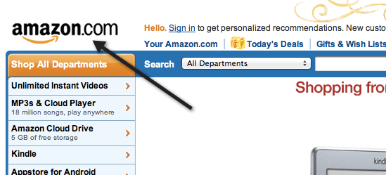
This particular technique works for any style of website, so whether you’re scaling a huge service-heavy but content-light layout (like Amazon) or a content-heavy but feature-light design (like a blog), the technique should be of use.


Better yet, the principle can help you organize your website’s information architecture; the proxority between pages is as important as what exists upon individual pages.


If you find yourself struggling to determine where stuff should be placed, this strategic guide will help you.


Priority: Boost the Best, Weed out the Worst


Many of us know only too well the benefits of prioritizing. The priority we give our content plays a huge part in the perceived value it has upon a page.


A site’s logo/name, for example, is recognizable because of its critically high placement, usually in the top left-hand corner, and it maintains visibility in that position on every page of a website.


A logo should be dominant over all other objects on a page. That’s its proxority.


Rate Each Element’s Value


To identify which pieces of a web page are most critical and important, we need to begin by examining every object in a layout, no matter how small.


Rate them based on their perceived value (according to what your visitors need to know or are likely to want to know) and their functional value (according to what contributions they make to the website, such as functionality or advertisements).


You can do this either by taking a screen capture (or printout) of the entire page and annotating it, or by producing a list of everything that appears on a page. This exercise will help you reassess the value of your website’s content.


Rate images, media, content (at a paragraph level), and everything else according to this numbering system:


RatingDescription of Element
1The website cannot function without this.
2This adds benefits but is non-essential.
3This supplements or reiterates content.
4This is redundant or wastes space in some other way.

Eliminate Unneeded Elements


When you’ve gone through everything, review the results.


Before we go any further, it’s probably worth mentioning that if you find content, links or objects that are no longer useful or don’t contribute anything, remove them.


Eliminating clutter from an interface is tough, but reductionism improves the general user experience of a website.


For elements rated at a 3, removal might be a bit harsh, so consider rewording or attaching things together to add value.


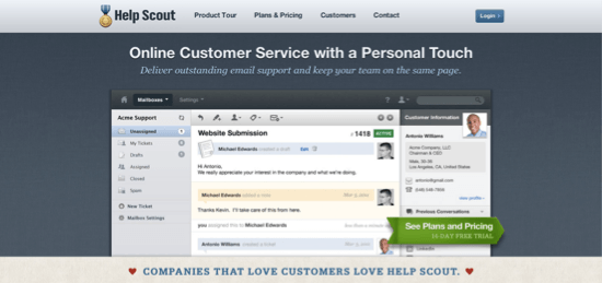
This website arranges its critical information into clearly defined segments for readability.


After you’ve identified the stuff that can be deleted, merged or moved, look at everything you’ve given a rating of 2. These elements can be the toughest to deal with because you want visitors to benefit from them, but you don’t want to overburden them.


One solution to giving these these needed, but non-essential elements an appropriate proxority is to use progressive disclosure: make content appear on demand with drop-down menus or tooltips, or display it further down the page so that it’s still available but less prominent.


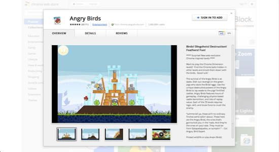
Many websites use progressive disclosure to avoid swamping their users with details.


Proximity: Flow, Feedback and Functionality


We’ve considered the importance of prioritizing every asset on your page, identifying which bits have more sway than others, eliminating the fluff that has accumulated, combining weak material into a strong structure and pushing the less critical data out of the field of vision.


We now need to take all the remaining content and follow through on the second part of the process: to connect everything logically and put it all back together, as if it were a jigsaw puzzle — or a storybook, wherein the plot develops at consecutive points.


You should be left with everything that needs to be on your website, in its most diluted form, with supplementary content either hidden down the page or waiting in tooltips and extensible data boxes.


Rate Important Elements in Relation to Each Other


Go back over everything to which you have assigned ranks of 1 and 2, and rank them again; number everything according to what order you believe readers need to know about it.


If everything ends up where it should end up, it will all make perfect sense when you read it aloud.


The developers and designers behind this website clearly understand the need for organization and feedback.


Redesign


Once you’ve got everything labeled, re-shuffle your source code to match the new reading order. Pay special attention to bits of content that connect to or depend on other pieces of content (such as image captions), and put them as close together as possible.


Then, make the necessary changes to your CSS and JavaScript.


Proxority: Examples and Patterns in Action


Many websites already exhibit what I’d define as high proxority in that they take great care to use techniques that account for both priority (bringing attention to certain elements) and proximity (making reactions happen directly next to or above the objects being interacted with).


Below is a showcase of a few examples of best practices in use. Some we’ve briefly mentioned before, and others are being introduced here. By following similar practices, you can avoid user confusion and increase reading efficiency.


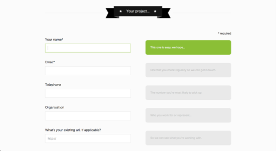
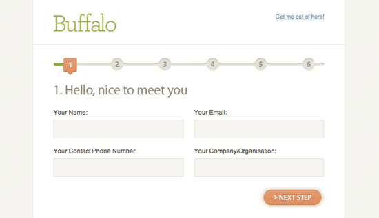
Using progressive disclosure to track the progress of a form:


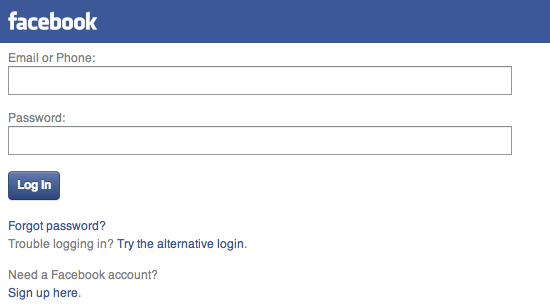
Informing visitors of errors as they enter data:


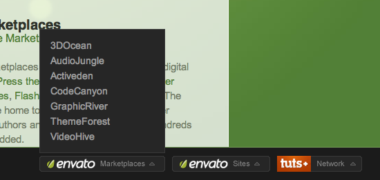
Drop-down menus expanding close to the cursor icon:


Input objects disabling once they’ve been submitted:


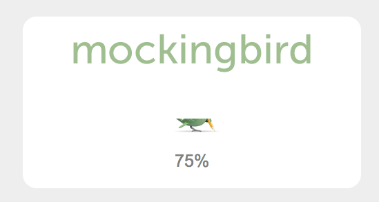
Progress bars showing loading progress:


Content or light boxes expanding upon user interaction:


Proxority: Origami for the Web


The proxority principle posits that everything you find on a web page can be assigned a value and a place in sequence, in relation to the objects that surround it. This idea has existed since the early days of the Web, but too few designers pay enough attention to it. Think through what is actually needed, where it is needed and when it should appear (as opposed to simply putting all of the content on the screen, in its entirety, in an order that "looks pretty"). The need for such techniques is increasing, especially given the proliferation of handheld devices and the idea of designing with a "mobile-first" philosophy.


If content isn’t worthy of a restrictive mobile layout, why is it needed in the desktop layout?


If you have ten spare minutes, give this simple activity a try. Go through your website and weed out anything that isn’t offering what it should. Make existing objects provide greater value to users (or use less space), and don’t be afraid to reorganize your code and its content to ensure that what’s needed is what appears. Oh, and if you do feel tempted to make actions elicit responses, ensure that users know that your website is responding; after all, you don’t want them clicking "submit" ten times in a row, only to fail.


Related Content


About the Author


Alexander Dawson is a freelance web designer, author and recreational software developer specializing in web standards, accessibility and UX design. As well as running a business called HiTechy and writing, he spends time on Twitter, SitePoint’s forums and other places, helping those in need.